System Drawing
Surveillane of a Glacier’s Death
2020
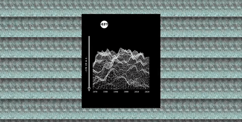
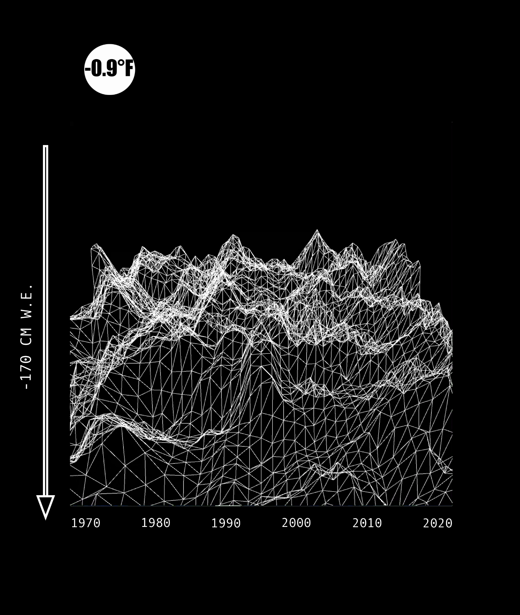
This system drawing uses multiple quantities: the annual decrease
in global glacier mass balance, and global temperature increase. The numbers on the left y-axis depict quantities of glacial melt, and the sun crossing the horizon contains numbers that represent the global increase in temperature coinciding with the timeline on the lower x-axis. The images in the background are of Klutlan Glacier in Alaska surveilled from 1972 to 2019 by NASA Landsat Satellite.
in global glacier mass balance, and global temperature increase. The numbers on the left y-axis depict quantities of glacial melt, and the sun crossing the horizon contains numbers that represent the global increase in temperature coinciding with the timeline on the lower x-axis. The images in the background are of Klutlan Glacier in Alaska surveilled from 1972 to 2019 by NASA Landsat Satellite.
Project Brief:
Develop a clear idea of a what aspect of your chosen system you will create a drawing for. It can be “drawing as a noun” where the image you make describes the system, or “drawing as a verb” where the image is a result or output of the system in some way. Use p5.js to generate at least PART of your project (you are also free to generate ALL of your drawing using this platform if you wish.)
Develop a clear idea of a what aspect of your chosen system you will create a drawing for. It can be “drawing as a noun” where the image you make describes the system, or “drawing as a verb” where the image is a result or output of the system in some way. Use p5.js to generate at least PART of your project (you are also free to generate ALL of your drawing using this platform if you wish.)